MASTERCARDLOUNGECAIRO
An ultra-luxury lounge inside Cairo International Airport. Concept, signage, and 2D system for a space designed to disappear into hospitality.
VIEW
An ultra-luxury lounge designed for business travelers passing through Cairo International Airport. A space that had to feel less like an airport and more like a private club.
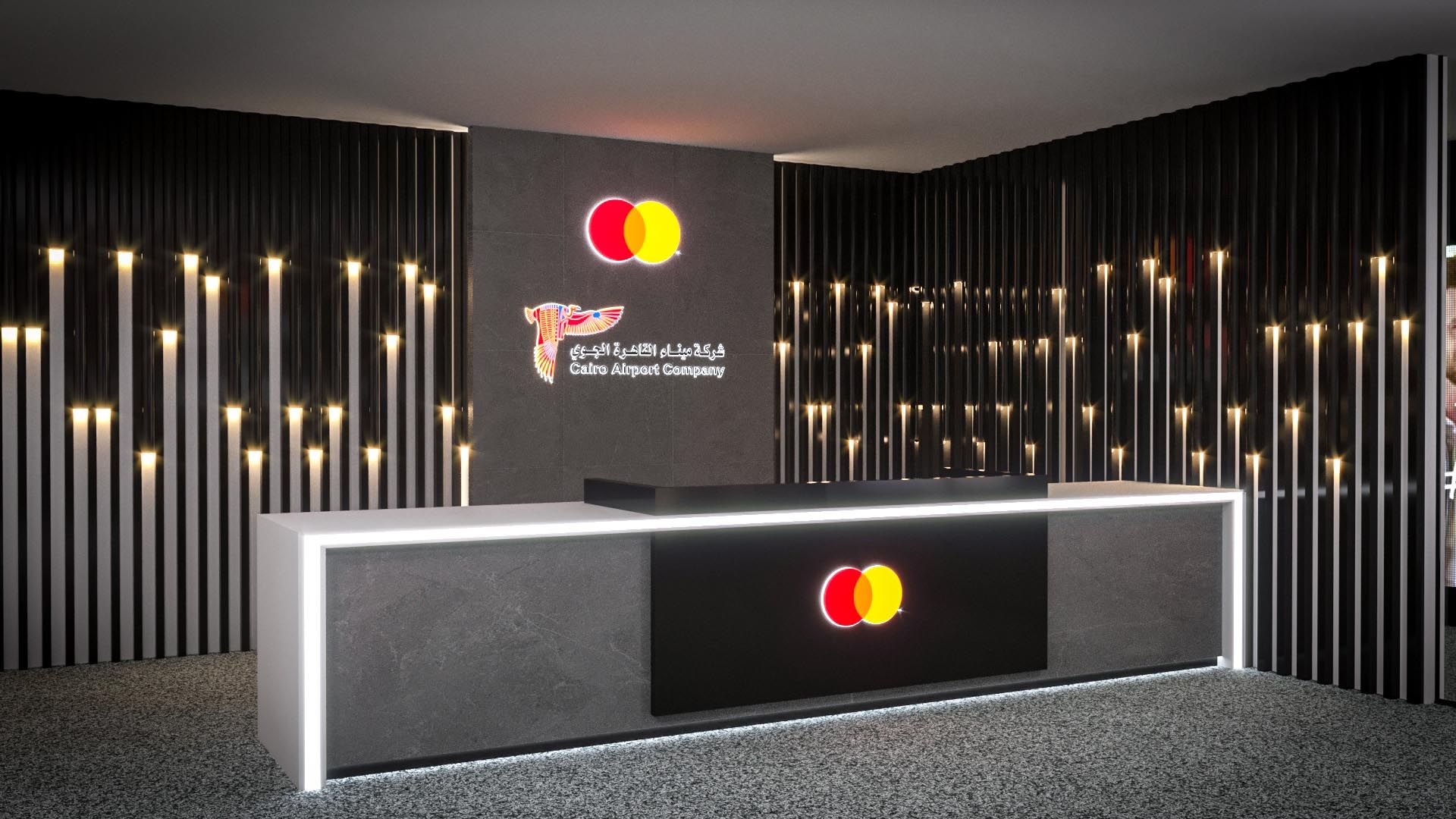
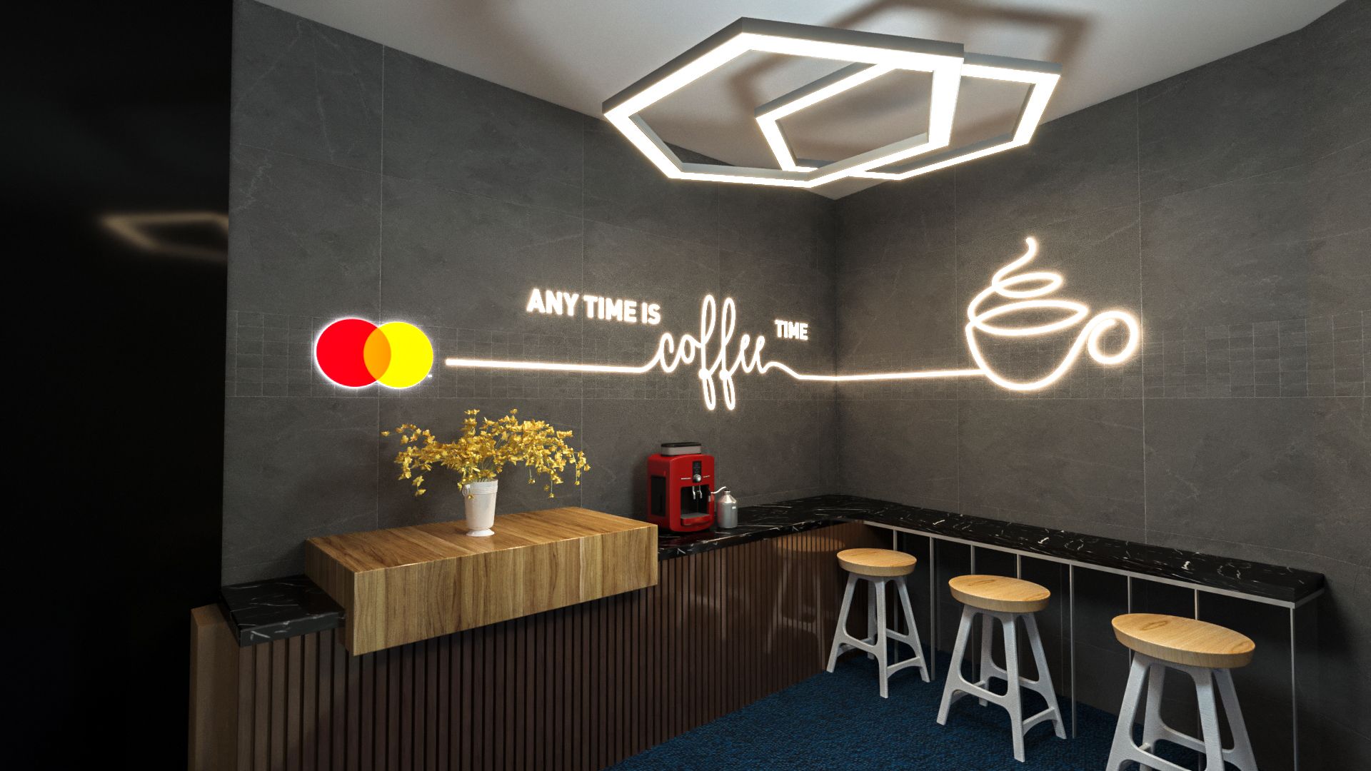
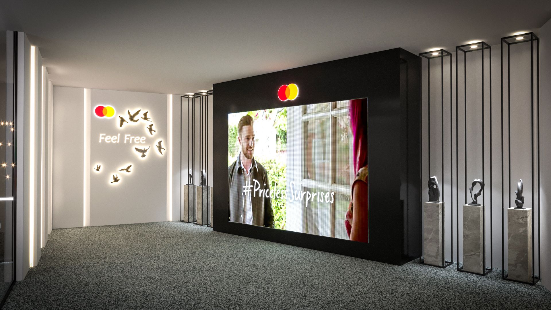
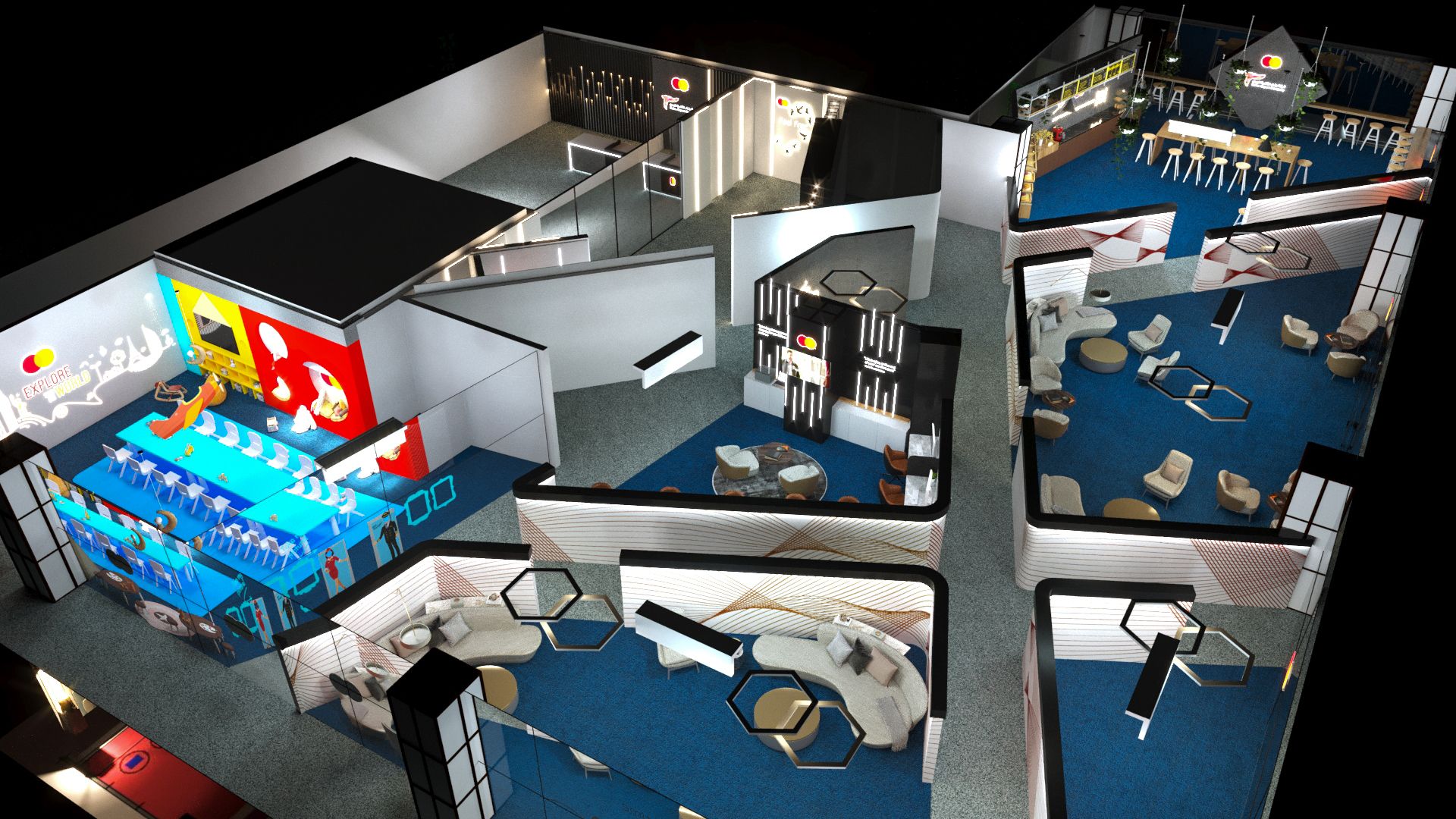
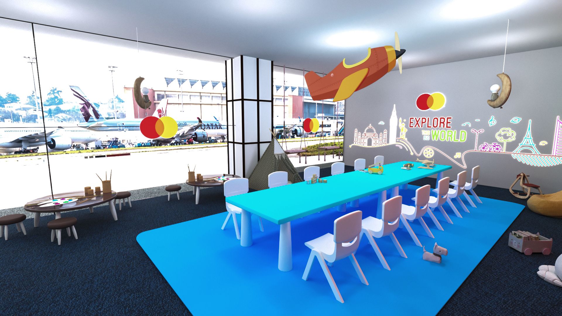
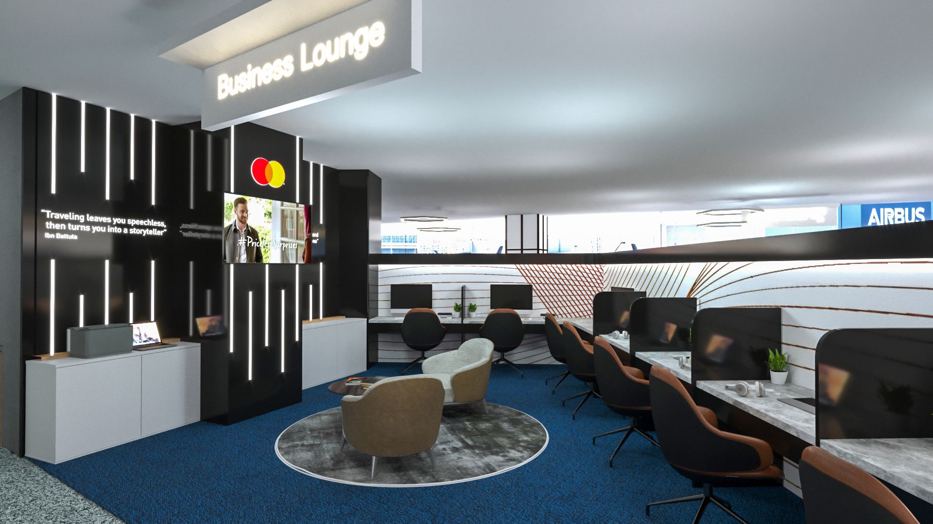
Mastercard developed the lounge as a premium hospitality offer for business cardholders, sited inside Cairo International Airport. The amenity set was generous: full coffee service, a children's play area, dedicated workstations, printers, charging stations. Working through Event House, the role was design lead on the pitch concept, 2D artwork and signage execution, with input on the 3D visualisation that carried the design into the spatial proposal.
The brief lived in the gap between two design tones. Mastercard's brand has a global hospitality posture; airport infrastructure imposes its own functional logic. The lounge had to read as Mastercard from the moment the cardholder walked in, while behaving with the wayfinding clarity that an airport environment demands.
THE CHALLENGE
An airport lounge has to do four things at once: signal status, deliver function, accommodate transient comfort (parents with children, working travelers, resters), and stay legible to people who are tired, in transit, and not paying close attention. The signage system had to be calm enough to feel premium and clear enough to navigate at a glance. The brand had to feel inevitable without leaning on logo repetition. The design had to operate at the scale of an interior while staying recognisable across the full Mastercard identity system.
THE RESPONSE
The pitch concept treated the lounge as a hospitality interior first and a brand surface second. Signage was reduced to essential wayfinding, set in a quiet typographic system that read clearly at airport pace without demanding attention. Mastercard's brand colour was used as a moment, not a wash: at the entrance, on the host station, at the threshold of the workstation zone. Everything else operated in warm neutral tones that signal premium hospitality. The 2D system covered every printed surface, from menu cards to wayfinding plates, with the same restraint logic.
ERA
BLES
- 01Lounge Concept & Pitch MaterialsConcept
- 02Signage & Wayfinding SystemEnvironmental
- 032D Artwork & Print CollateralPrint
- 043D Visualisation SupportSpatial
- 05Hospitality Touchpoint SetIdentity
Quiet at the surface, generous in the program. A premium environment is built from what you don't notice.
The design discipline was restraint: a full amenity program (coffee service, children's play, workstations, printers, charging) hosted inside an interior that felt unhurried. Signage and graphic application were used to reinforce the spatial logic rather than to compete with it. Mastercard's brand presence was concentrated at threshold moments where cardholders arrive or transition, then released into hospitality language for the rest of the room.
The 3D visualisation work translated those decisions into a spatial proposal that the client could read against the airport's structural constraints. Pitching to an airport-grade tenant requires showing the design as a working operation, not a glamour render. The 3D layer was developed in support of that, not as a separate visual artifact.
"The pitch read the lounge as a hospitality interior first, a brand surface second. The brand carries the threshold; the room carries the rest."
Project notes · 2021
THE OUTCOME
Concept and visual system delivered as a complete pitch package, with 2D artwork and signage integrated into the 3D spatial proposal.
Wayfinding clarity met premium-hospitality restraint. Signage operated for tired travelers without compromising the lounge's tone.
From threshold signage to menu cards, every printed and signed surface ran on a single typographic and material logic.