MINCEBURGERSREBRAND
A full visual identity overhaul for Egypt's largest local burger chain by branch count. Logo, signage, packaging, social, all rolled out across the network.

VIEW
The largest local burger chain in Egypt by branch count, in need of a single coherent visual identity it could roll across every branch in the network.
Joining Morico, the parent company, as its first in-house designer, the assignment was a complete visual identity overhaul for the Mince Burgers brand. The work covered logo evolution, signage systems, packaging design, napkins and collateral, social media direction, and direct coordination with print production houses to make sure the new system rolled out cleanly across the chain.
With many operating branches and substantial rebranding budgets in play, every decision had to balance ambition against the practical reality of swapping signage and packaging at scale. The brief was less about reinvention than about resolution: take what already existed and make it operate as a system.
THE CHALLENGE
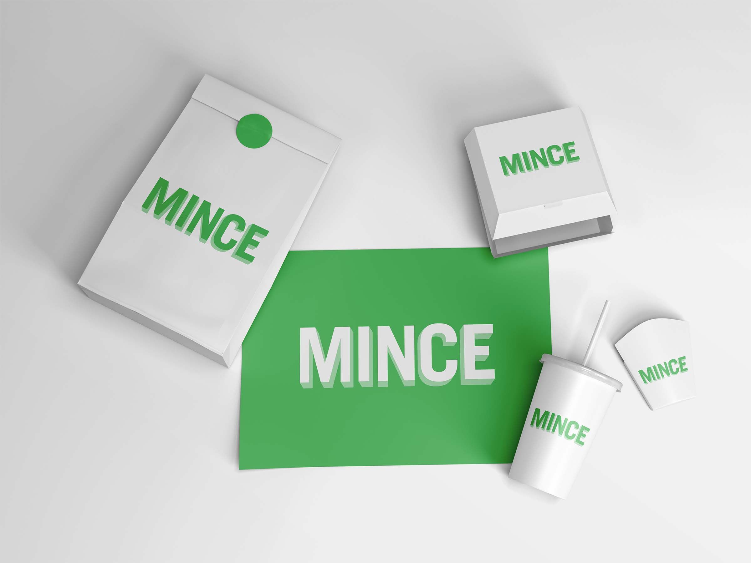
The existing brand split its colour story across surfaces. Signage was green. Packaging was brown. The logo had recognition in market but lacked the consistency to operate as a single visual identity. With dozens of branches and packaging stocks already in circulation, any change had to preserve the equity already built into the mark while resolving the inconsistency that was making the brand feel fragmented.
THE RESPONSE
The new logo was designed to maintain visual continuity with the existing mark, an evolution rather than a replacement, so customer recognition carried forward rather than reset. The brand unified its colour approach next: a single green logo system applied across every surface, signage and packaging alike. One mark, one colour, every touchpoint. The fragmentation collapsed into a system that could finally hold together.
ERA
BLES
- 01Logo Evolution & Mark RefinementIdentity
- 02Unified Colour SystemIdentity
- 03Signage System & SpecificationsEnvironmental
- 04Packaging DesignPackaging
- 05Napkins & Disposable CollateralPrint
- 06Social Media DirectionDigital
- 07Production House CoordinationProduction
CESS
Evolution, not reinvention. Recognition is harder to earn than to lose.
The first decision was the most strategic one: not to start from scratch. With an established branch network and an existing place in the local market, the brand had recognition equity that a clean-slate redesign would have erased. The new mark was tuned, refined, and tightened in proportion, but kept the silhouette and gestural feel of the original close enough that customers reading it on a street sign would not notice a brand change, only a brand sharpening.
From there, the work became a question of sequencing. Logo first, then colour rationalisation, then signage and packaging in lockstep, then production coordination so the print houses could roll the system out branch by branch without bottlenecking the operation. The social media direction came last, by which point the visual system was strong enough to govern its own application.
"His work is to be noted on revamping brands and planning long-term, especially with brands like Mince and Ted's, where his input was invaluable."
Senior Creative Director · Partner Agency
THE OUTCOME
A single unified visual identity replaced a fragmented colour split between signage and packaging across the network.
Logo evolution kept brand equity intact through the rollout. Customers read the change as sharpening, not reinvention.
Direct coordination with print and signage producers kept the rollout consistent across dozens of branches without quality drift.